JavaScript Data GridHandsontable Design System
Design, prototype, and customize your data grid with the Design System for Figma.
Overview
The Handsontable Design System is a complete toolkit for building, prototyping, and customizing data grids with Handsontable. It includes grid components and design tokens, making it easy to fit Handsontable into your app’s layout or customize it in ways that wouldn’t be possible without built-in features like auto layout, variables, and more.
Live preview
Open the Design System in Figma (opens new window)
Use tokens to generate a theme
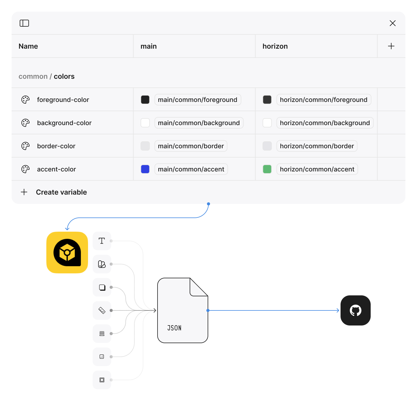
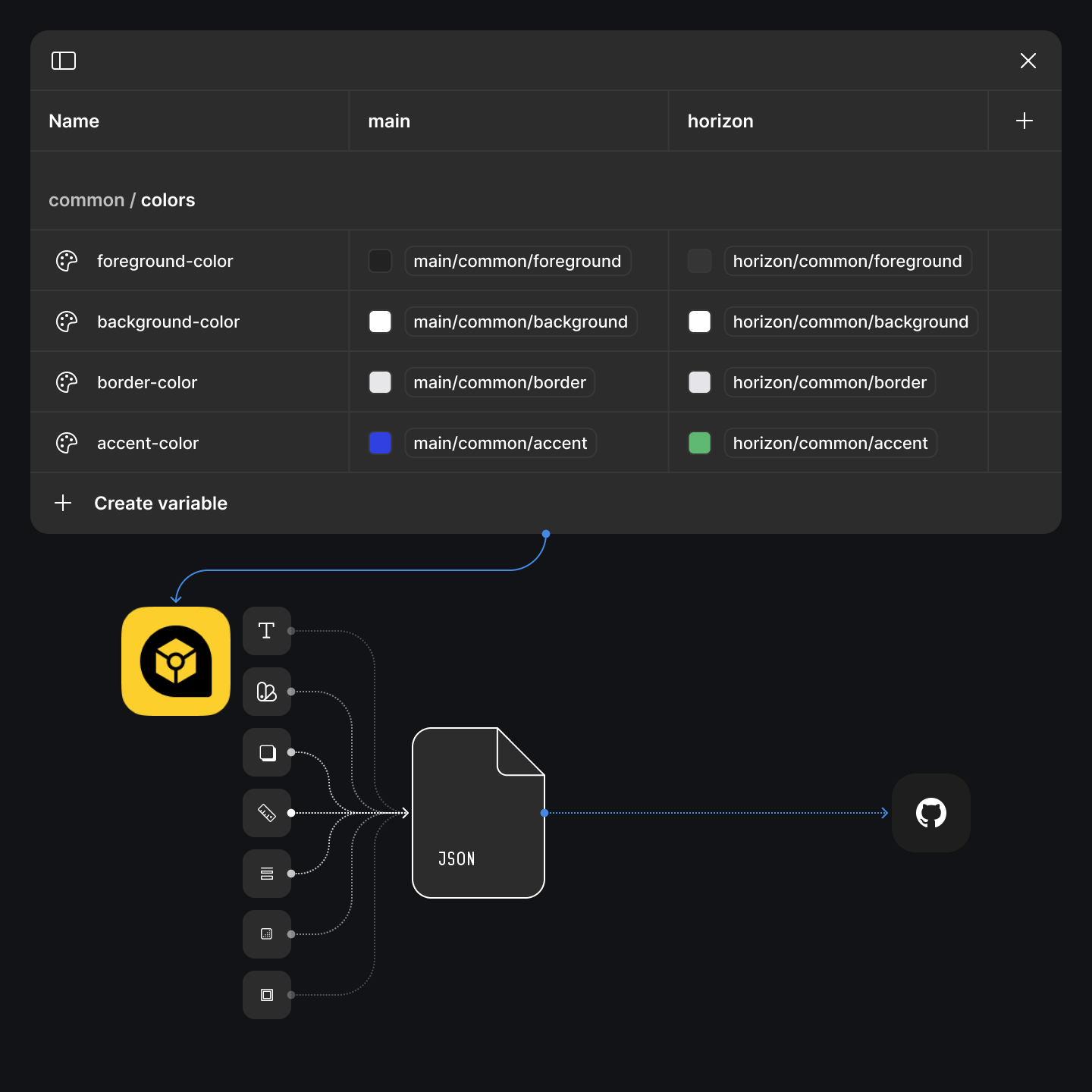
Inside the Figma file, you’ll find local variables that define all parts of the data grid — like colors, spacing, font styles, icon sizes, and more. These variables are organized into two themes: Main and Horizon, each available in both light and dark mode.
You can tweak the variables however you like to match your brand or product style. Once you’re happy with the changes, export them as JSON tokens. We recommend using the Design Tokens (opens new window) plugin from the Figma Community — it’s straightforward and does the job well.
After exporting, head over to our Theme Generator on GitHub (opens new window) to convert your tokens into a CSS theme file that works with Handsontable.


Updates frequency
The design system is our primary reference when planning new features or redesigns, and it’s always kept up to date. In some cases, we update the design system independently of product releases to enhance consistency and streamline the design workflow.
Known limitations
- The Classic theme isn’t included in the design system because we no longer recommend using it for new projects.
Troubleshooting
Didn't find what you need? Try this:
- View related topics (opens new window) on GitHub
- Report an issue (opens new window) on GitHub
- Ask a question (opens new window) on Stack Overflow
- Start a discussion (opens new window) on Handsontable's forum
- Contact our technical support (opens new window) to get help